Indoor plants are more than just living décor — they’re an extension of your home’s personality. The right greenery can complement your interior design, enhance your color palette, and create a cohesive, harmonious atmosphere. But while most people choose houseplants based on care requirements or popularity, few realize how dramatically plants can influence — and be influenced by — the colors around them.
Whether you’re designing a modern minimalist apartment, a rustic bohemian haven, or a cozy cottage-style space, matching your indoor plants with your home’s color palette is both an art and a science. This guide explores how to balance hues, textures, and tones to make your home look effortlessly curated and vibrant.
Why Color Coordination Matters in Plant Styling
Colors shape how we feel in a space. Warm tones (reds, oranges, yellows) evoke energy and passion, while cool tones (blues, greens, purples) bring calm and serenity. Since plants are naturally green — a color that symbolizes growth, renewal, and balance — they already create a grounding visual foundation.
However, not all greens are equal. Foliage comes in various shades — from lime and emerald to deep forest and variegated mixes. When paired thoughtfully with your home’s color palette, plants can:
- Enhance mood and visual harmony.
- Accentuate your décor theme.
- Create contrast or continuity, depending on placement.
- Highlight architectural features or soften harsh design lines.
In short, choosing plants for color balance is like selecting artwork or furniture — each should play a role in your overall visual story.
Step 1: Identify Your Home’s Color Palette
Before you select plants, assess the color foundation of your interiors. Take note of:
- Wall colors (paint, wallpaper, or exposed materials like brick or wood).
- Furniture hues (sofa fabrics, tables, shelving).
- Accent tones (rugs, cushions, curtains, art pieces).
Your color scheme likely falls into one of these three categories:
- Neutral Palette: Whites, creams, grays, taupes, and beige tones.
- Cool Palette: Blues, greens, lavenders, silvers, and cool grays.
- Warm Palette: Reds, oranges, yellows, browns, and gold tones.
Once you identify your base, you can choose plants that either complement or contrast it for visual balance.

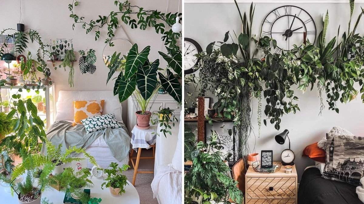
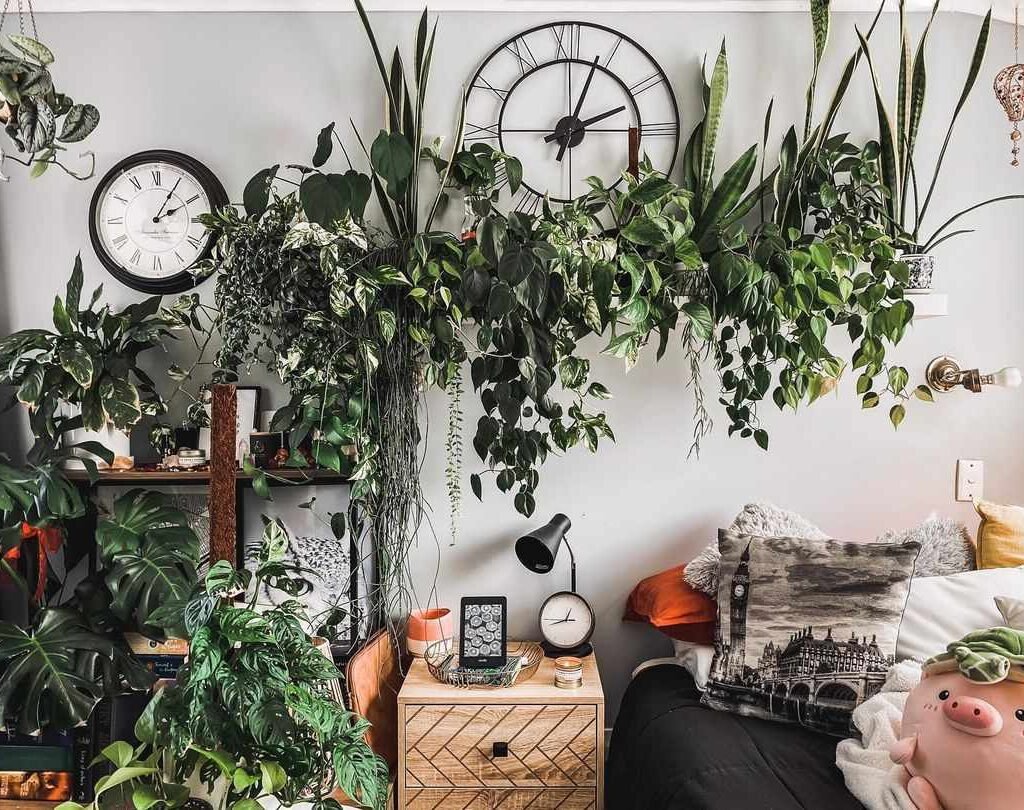
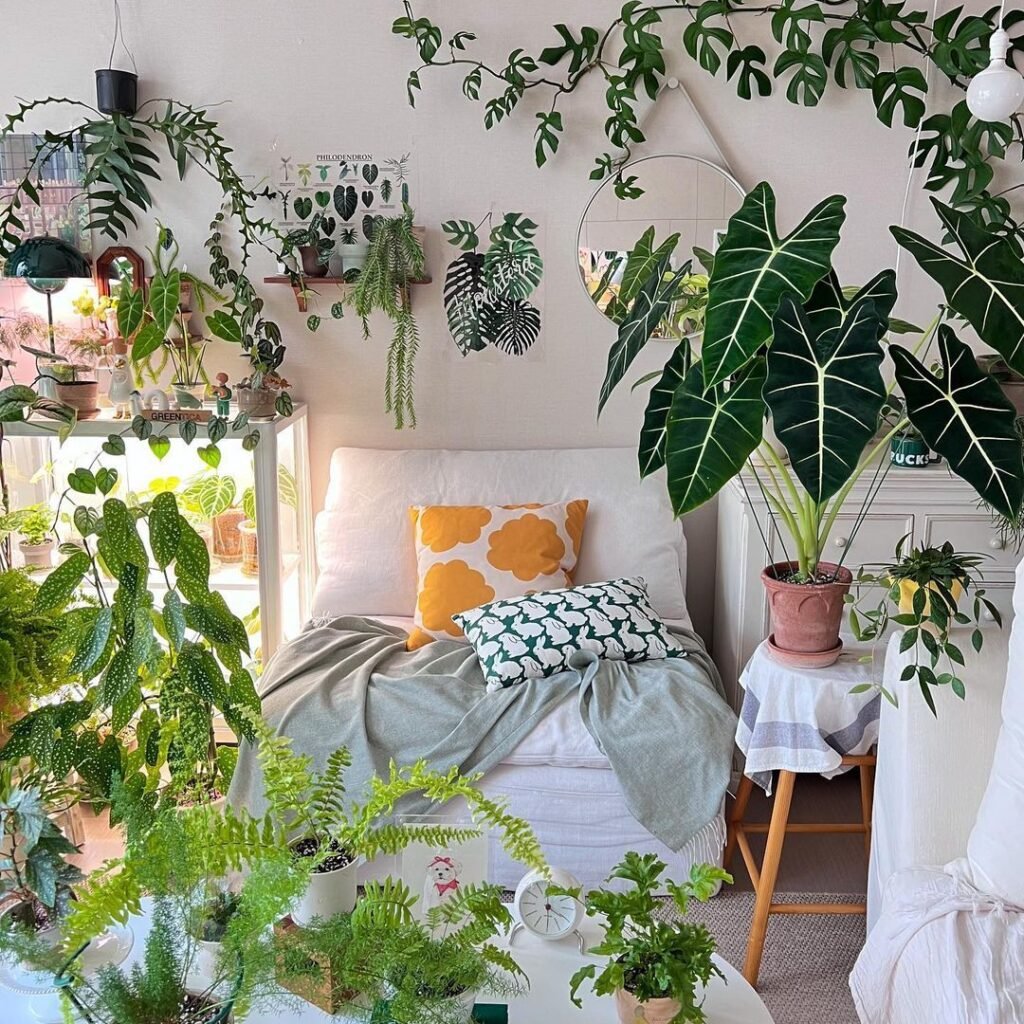
Step 2: Choose Plants That Complement Neutral Interiors
Neutral interiors — think Scandinavian, modern minimalist, or Japandi styles — rely on simplicity, balance, and texture. Here, plants add a burst of life without overwhelming the calm aesthetic.
Best plant choices:
- Monstera deliciosa: Its glossy, split leaves introduce rich green tones and sculptural shape.
- Fiddle Leaf Fig: The bold, dark green foliage provides striking contrast against white or beige walls.
- Snake Plant (Sansevieria): Vertical lines and yellow-edged leaves add height and subtle color definition.
- ZZ Plant: Deep green leaves complement soft neutrals beautifully, maintaining a serene look.
Design tip:
Use simple, muted pots (white ceramic, light wood, or matte gray) to keep the focus on the plant’s form and greenery. Layer plants at different heights for dimension without clutter.
Step 3: Match Plants to Cool-Toned Interiors
Cool-toned homes — with shades of blue, gray, or mint — benefit from plants that enhance tranquility and freshness. Choose foliage that has blue-green undertones, silvery leaves, or variegation to echo your décor’s cool energy.
Best plant choices:
- Eucalyptus or Silver Pothos (Scindapsus pictus): Their silvery foliage harmonizes beautifully with blue-gray spaces.
- Fern varieties (Boston or Maidenhair): Their feathery textures add softness to sleek, cool rooms.
- Peace Lily: Its dark leaves and white blooms provide balance and a clean, modern look.
- Calathea Orbifolia: Silvery striped leaves complement light gray and pastel interiors.
Design tip:
Use metallic or glass pots to reflect natural light and enhance cool tones. Group plants in clusters of three for a balanced, contemporary aesthetic.
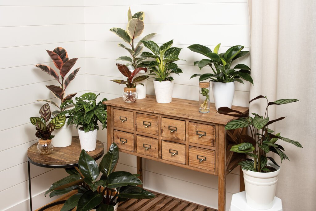
Step 4: Pair Plants With Warm-Toned Interiors
Warm-toned homes — rich in terracotta, beige, ochre, or golden shades — benefit from plants that add depth and vibrancy. Opt for species with red, burgundy, or dark green foliage to create harmony with the surrounding warmth.
Best plant choices:

- Rubber Plant (Ficus elastica ‘Burgundy’): The deep maroon leaves echo earthy interiors.
- Croton: Offers multicolored foliage (yellow, red, orange, green) that complements warm palettes.
- Philodendron Pink Princess: Touches of pink contrast beautifully with brown or gold tones.
- Anthurium: Its bright red flowers pop against wooden or terracotta backgrounds.
Design tip:
Choose textured pots in warm materials like clay, rattan, or brass to amplify the cozy atmosphere. Mix plants with varying leaf shapes to create movement and visual warmth.
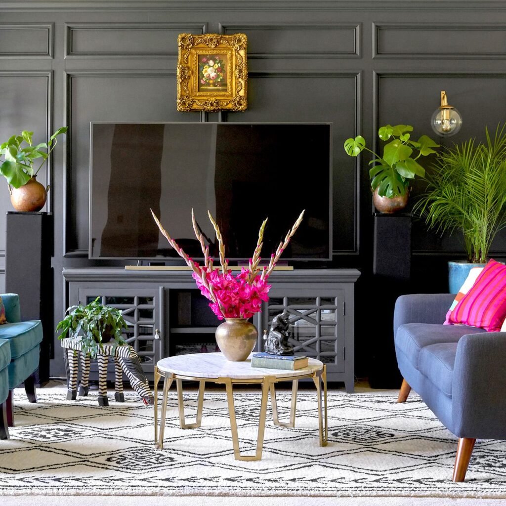
Step 5: Use Contrasting Colors for Bold Statements
If your interior style leans bold or eclectic, contrasting colors can make a striking statement. A green plant against a vibrant accent wall (like mustard yellow or navy blue) can create a dramatic focal point.
Example combinations:
- Green foliage + Terracotta wall: Earthy, Mediterranean vibe.
- Emerald green + Deep navy: Luxurious and modern.
- Lime green + Charcoal gray: Energetic and contemporary.
- Variegated plants + Pastel backdrops: Airy and whimsical.
Best plant choices:
- Variegated Rubber Plant: Adds light contrast with cream streaks.
- Maranta (Prayer Plant): Features red veins that pop against neutral or blue tones.
- Chinese Evergreen: Comes in pink, red, or silver varieties that contrast beautifully with darker walls.
Design tip:
Limit the number of contrasting plants to avoid chaos. Focus on a few statement pieces that draw the eye.
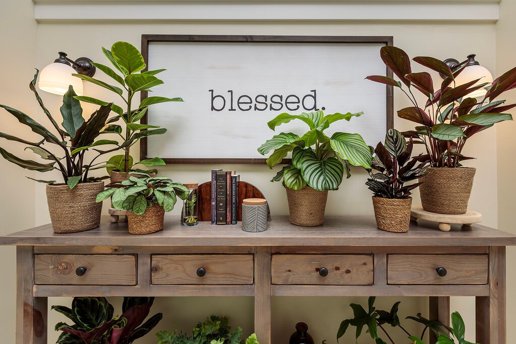
Step 6: Match Pots and Planters to Your Palette
Your plant pots play a huge role in how the greenery fits your color scheme.
- For Neutral Homes: Go for matte white, beige, or soft stone textures.
- For Cool-Toned Homes: Choose ceramic or metal pots in blue, gray, or silver.
- For Warm-Toned Homes: Terracotta, woven baskets, or brass planters enhance earthy vibes.
- For Eclectic Homes: Mix bold patterns, colorful pots, or geometric designs for artistic flair.
Remember: The pot color should complement both the plant and the room, not compete with them.
Step 7: Consider Leaf Color and Texture
Beyond basic green, many indoor plants feature colorful or patterned foliage that can match your décor palette perfectly.

Plants with colorful leaves:
- Coleus: Available in vibrant red, pink, and purple patterns.
- Caladium: Heart-shaped leaves with white, pink, and green variations.
- Aglaonema: Comes in silver, pink, or red varieties, perfect for adding subtle color highlights.
Plants with unique textures:
- Cactus or succulents: Match modern or desert-toned interiors.
- Ferns: Soften industrial spaces with their delicate leaves.
- Philodendrons: Glossy leaves suit contemporary or luxury settings.
Design tip:
Combine plants with different textures and leaf finishes (matte, glossy, fuzzy) to create depth without overwhelming your color palette.
Step 8: Balance Light and Visual Weight
Color matching doesn’t just involve hues — it’s also about balance and visual weight. A dark-leafed rubber plant might anchor a light room, while a delicate fern softens a heavy-toned interior.
Follow these principles:
- Use darker plants to ground light-colored rooms.
- Use lighter or variegated plants to lift darker spaces.
- Group plants in odd numbers (3 or 5) for natural balance.
- Vary heights with plant stands to draw the eye upward.
This ensures your plants look intentional, not just placed randomly.
Step 9: Use Greenery as a Transition Element
Plants can act as a bridge between two different color zones in your home — for example, connecting a neutral living room with a colorful dining area. Strategic placement of a tall, lush plant like a parlor palm or monstera can visually unify the space.
For open layouts, use large statement plants to anchor corners or entryways. In smaller rooms, go for hanging plants or wall planters that introduce color without crowding the space.

Step 10: Keep It Personal and Evolving
Finally, remember that your color palette — and plant collection — can evolve. The beauty of decorating with plants is flexibility. You can move, repot, or swap species as your style changes.
Don’t be afraid to experiment with combinations — a pop of red bromeliad in a blue room or a trailing pothos against a white brick wall might surprise you with how well it fits.
Conclusion
Matching indoor plants with your home’s color palette goes beyond aesthetics — it’s about creating harmony between nature and design. The right plant not only enhances your décor but also brings balance, freshness, and emotion into every room.
By understanding your home’s color scheme and selecting plants that complement or contrast it beautifully, you can turn your living space into a living canvas — where greenery becomes an integral part of your interior story.
Leave A Comment